Abstract
Many industries use quality improvement methods and tools to measure and improve their processes. There has been a recent movement to apply a similar approach within the healthcare industry to improve the quality and efficiency of hospital and practice operations. Radiology practices or practice settings are an excellent field for application of these methods. The following tools are commonly used in quality improvement processes: run chart, Pareto chart, flow chart, and cause-and-effect diagram. By themselves or in combination, they may provide an adequate measure of performance. This chapter provides definitions and practical examples of using each of these tools in the context of radiology practice. Overall, these tools can be used to help measure and consequently improve the quality and efficiency of any practice or department.
Keywords
Cause-and-effect diagram, control chart, fishbone diagram, flow chart, Pareto chart, process map, run chart
Introduction
The challenge of a changing economy and increasing pressure in healthcare for optimal performance while dealing with limited resources and maintaining the high quality levels of medicine is becoming increasingly difficult. There is increasing demand for quality improvement to drive improved outcomes and reduce costs. The primary methodology used to deliver improved quality with lower costs is a process improvement methodology known as Lean Six Sigma. Lean Six Sigma originated in manufacturing and has since migrated to almost all industries, including healthcare. It has proven highly effective in its application to all aspects of care delivery, including patient satisfaction.
In all practices and industries there are processes that generate specific outcomes. The outcomes are measured by the level of quality. The level of quality is measured and defined by the specific customers of the processes. These customers may be internal to the organization or considered external customers. Examples of internal customers are a hospital or radiology group, and an external customer would be a patient or an insurance carrier.
A process is a combination of tasks in a specified order designed to create a specific outcome. An example would be the activities necessary to perform a radiologic study and generate a report. The outcome of this process is a completed radiology report.
The quality measures of this process are the metrics used to measure specific attributes of the process and the outcomes. However, before this can be done, a baseline performance of the metric in question must be established. Typically, a dashboard made up of key performance indicators is used to assess the current state of operations. We can use key performance indicators that represent high-level metrics to assess the performance of the operation. For the indicators that are not performing at the target level, the quality metrics impacting that indicator will be deduced.
It is important to explicitly define how all quality metrics will be measured, and for this reason operational definitions are used. It is extremely important to be as specific as possible in clearly stating operational definitions, because the accuracy of the operational definition will directly impact the accuracy of the metric being used to measure quality. If the measurement system of the process is not clearly defined through operational definitions, it may introduce increased variation in results.
The general approach in many industries emphasizes continuous improvement of processes to maintain and sustain high-quality performance. The foundation of Lean Six Sigma is based upon key quality improvement tools. Quality improvement tools can be applied as standalone tools or as part of an overall improvement effort, such as a process improvement project or activity. Finally, the quality activities should represent a continuous system that strives to improve the process.
Case Study
To illustrate the application of some key quality improvement tools we will use examples of process improvement activities in a radiology department.
Case Description
A radiology department has a problem with a large study queue. The large study queue results in increased lag time to process the requested studies. This has a negative impact on other departments’ metrics, such as emergency department wait time and length of hospital stay. Examination of dashboard key performance indicators shows an unexpected decrease in productivity along with a decreased number of generated reports when compared to prior years. The department head has asked his team to look into the process and apply various quality improvement tools to understand the problem and identify the root cause issues; this information will be applied to drive corrective actions. The goal is to improve the number of generated reports without negatively impacting the report quality and patient satisfaction.
Case Workup
The first step is to examine the process and define its outcomes. The number of reports generated will be the outcome metric.
The operational definition of the outcome metric (reports generated) is the following: A report is generated once the report is completed, finalized, submitted to the electronic health record, and the critical findings have been communicated to the ordering physician.
The following steps outline the sequence of further analysis and the quality tools used for that analysis:
- 1.
The first step is to examine the outcome metric of how many reports were produced year over year. This is done by creating a run chart.
- 2.
The second step is to define the process or the combination of tasks in a specified order to create the report and identify the responsible parties. This is done by creating a flow chart (also known as a process map).
- 3.
The third step is to categorize and quantify high-level factors to narrow the focus and provide a general idea of where the main issue is occurring. This is done by generating a Pareto chart.
- 4.
The fourth step is to analyze the contributing factors that influence the creation of the report by generating a cause-and-effect diagram (fishbone diagram).
Once the key specific factors (root causes) have been identified, the appropriate corrective actions can be determined and then taken to improve the established quality metric.
Run Chart
Definition
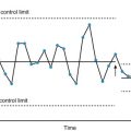
A run chart, also known as a run-sequence plot, is a graph that displays observed data plotted with respect to time. Often, the data displayed represent some aspect of the performance of a business process. This chart may be used to establish basic trends in relation to specific time periods. However, the interpretation is limited due to the characteristics of the data used. Run charts can be used to examine potential special causes of nonrandom variation in the data, specifically oscillation, clustering, mixtures, and trends. For instance, a cluster pattern may indicate variation due to special events such as a point of introduced change in the process, whereas mixture and oscillating patterns occur when the data fluctuate around a certain point or baseline, which can occur due to several factors affecting the process. The following example represents a sustained drift in the data, which can be interpreted as an upward trend until a turning point, after which the number of relative value units (RVUs) starts to trend down.
Example
The number of study reports produced by the radiology department, normalized by RVUs, will be used to account for the difference in complexity of the studies plotted per year. Fig. 4.1 demonstrates a drastic decrease in RVUs in 2015.