Fig. 1
A histogram of peak intensity based on the statistical analysis of 3,450 spectra recorded from a tissue section of mouse brain. Inset, percentage of the original data which can be retained after data reduction as a function of the threshold which is set for identification of “real peaks.” Figure taken from reference [8] with permission
3.
Assign the maxima in the histogram as noise level. Set the threshold of signal-to-noise ratio (S/N) as 3. Identify peaks in raw spectra with signal intensity of three times of the noise level and higher as “real peaks.” Identify other peaks with signal intensity lower than three times of the noise level as noise or background peaks. Perform a data reduction by removing these identified noise and background peaks (see Note 5 ).
4.
Perform peak alignment to assign accurate m/z values on “real peaks” to eliminate mass shifts for the same analytes in spectra that are recorded from different sampling points on tissue sections (Fig. 2a). As an example, Fig. 2b and c shows the peak alignment for phosphatidylinositols (PS, 18:0/22:6).


Fig. 2
(a) Plotting of peaks (PS 18:0/22:6, m/z 834.6) extracted from different spectra, showing mass shifts among different scans. The maximum of each plot is marked with a red dot. (b) Distribution of m/z value for the peaks (PS 18:0/22:6) extracted from all spectra. (c) Plotting of the positions of peaks extracted within a mass range m/z 834-839 before (top) and after peak alignment (bottom). Figure taken from reference [8] with permission
(a)
Extract the peaks around m/z 834.6 in all 3,450 spectra that are obtained from the same tissue section. Set the m/z window based on the MS analysis resolution of the mass spectrometer, which is 0.1 Th for the data recorded using an Exactive. Plot the counts of peaks within each m/z window as a function of the m/z value (Fig. 2b).
(b)
Fit the counts of peaks around m/z 834.6 to a Gaussian distribution.
3.3 2D Imaging Data Visualization and Analysis
3.3.1 2D Imaging Visualization
1.
Convert the mass spectra files (.raw) collected using LTQ or Exactive with Xcalibur 2.0 into Analyze 7.5 format files (.img,.hdr, and.t2m files) using ImgConverter v3.0 [10] or home-written programs [11]. The number of pixels on x and y dimensions is required for file format conversion. Conversion of raw data files recorded using other mass spectrometers can also be done (see Note 9 ).
2.
Load the converted files into visualization software, such as Biomap [10], Datacube Explorer [12], and MITICS [13]. Choose a peak for data visualization with appropriate color template, rainbow color scale, and contrast. Save the created image file. Repeat this process to create ion maps of all peaks of interest [10].
3.
Overlay two or more ion maps using the overlay function of Biomap to show the distributions of different compounds when necessary (Fig. 3) [10].


Fig. 3
DESI imaging of a rat brain tissue section. The rat received clozapine and was killed after 45 min. (a) Distribution of phosphatidylcholine (PC 36:1), [M + K]+ m/z 826.3; (b) distribution of clozapine [M + H]+ m/z 327.3; (c) image of overlaid phosphatidylcholine and clozapine created with Biomap. Figure taken from reference [10] with permission
3.3.2 2D Imaging Data Analysis
1.
Split tissue sections into training set and validation set. Collect spectra from both tissue sets using DESI imaging and obtain the training imaging data set and validation imaging data set, respectively.
2.
Resample all pixels in the imaging data sets to unit resolution. Calculate the area under the curve of all spectra. Normalize all spectra using the median area value by scaling each pixel to this value.
3.
Deploy principal component analysis (PCA) to the training data set collected from the training tissue sections. Generate a set of principal components (PCs). List the eigenvalues and eigenvectors in an order of decreasing component variance and pick the first three principal components for data visualization (see Note 10 ).
4.
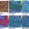
Deploy PCA to the validation data set using the PCs obtained from training data set. Scale each set of eigenvalues over the range of 0-255 and assign a color on it within the RGB color space. Eigenvalues of PC1 are converted into the red color channel, eigenvalues of PC2 are converted into the green color channel, and eigenvalues of PC3 are converted into the blue color channel. Assign the RGB color value on each corresponding pixel and create an image based on these pixels for data visualization (Fig. 4) (see Note 11 ).


Fig. 4
(a) Optical image of the H&E-stained tissue sections including the areas of cancer and adjacent normal tissue. DESI imaging of prostate tissues showing the distributions of (b) FA (20:4), m/z 303.3, and (c) cholesterol sulfate, m/z 465.4. (d) Image developed with PCA; the false colors plotted here are generated on the basis of PC1, PC2, and PC3. Figure adapted with permission from reference [14]. Copyright 2010 American Chemical Society
3.4 3D Imaging Data Visualization and Analysis
Additional steps in data processing are required to build a data set in 3D data space.
3.4.1 Tissue Section Alignment
Data analysis can be performed to identify the shapes of the tissue sections and some major features that can be used in the computer-assisted alignment of the tissue sections. This is important for creating a valid 3D data set.
1.
Classify MS images into sample and substrate regions with self-organizing feature map (SOFM) artificial neural network method. Identify the tissue sample region by applying SOFM on spectra with original signal intensity to separate the sample region from background (Fig. 5a).
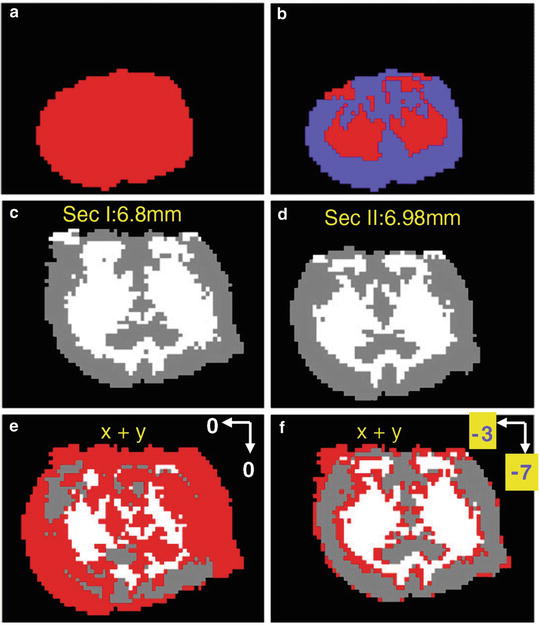

Fig. 5
(a) Apply SOFM on the image of a tissue section to obtain a classification into (a) two categories, tissue and background, and (b) three categories, gray matter, white matter, and background. (c, d) Images of two adjacent tissue sections (I and II) with three features classified with SOFM. The two images are not aligned. Image can be created by overlapping the sections I and II (e) without alignment and (f) with alignment. The section II is moved 7 pixels up and 3 pixels to the left. From (c) to (f), gray and white color represents gray matter and white matter, respectively. Red region represents the mismatched pixels between sections I and II. Figure taken from reference [8] with permission
2.
For mouse brain tissue 3D imaging, apply SOFM twice on each MS image to differentiate white matter region and gray matter regions (Fig. 5b).
3.
3.4.2 Intersection Data Normalization and Image Insertion
1.
For 3D imaging, perform interpolation to generate additional layers to improve the smoothness of 3D-visualized images after data set reconstruction (see Note 15 ).
2.
Generate inserted data for the appropriate image component between two adjacent real layers with linear interpolation method. Equation 1 shows how to generate an insert pixel with a coordinate (x 0, y 0) on the insert layer z based on data interpolation of corresponding pixels with the same coordinate (x 0, y 0) on layers z 1 and z 2:


(1)
where P 1 and P 2 are the signal intensities of the MS peaks obtained at the sampling points with the coordinates (x 0, y 0) on layers z 1 and z 2, respectively.
3.
Perform 65,550 data interpolations on 19 lipid peaks over 3,450 pixels to generate one insert layer. Construct a 3D data set containing all data obtained from both the original layers and the insert layers. Figure 6 shows the two insert layers with the distributions of PS 18:0/22:6 (m/z 834.6) and sulfatides (ST, 24:1, m/z 888.8) generated with linear interpolation method (see Note 16 ).
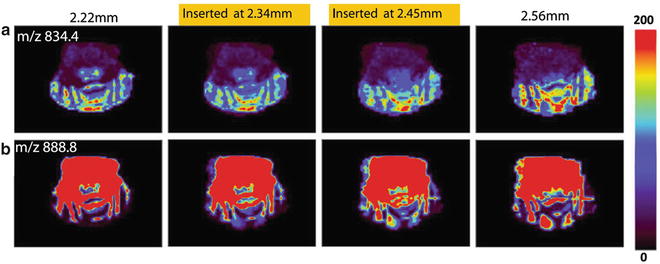

Fig. 6
The 2D images of the distribution of (a) PS 18:0/22:6 (m/z 834.6) and (b) ST 24:1(m/z 888.8) generated from the two actual tissue sections (the most left and the most right images). Figure taken from reference [8] with permission
3.4.3 3D Imaging Data Visualization
1.
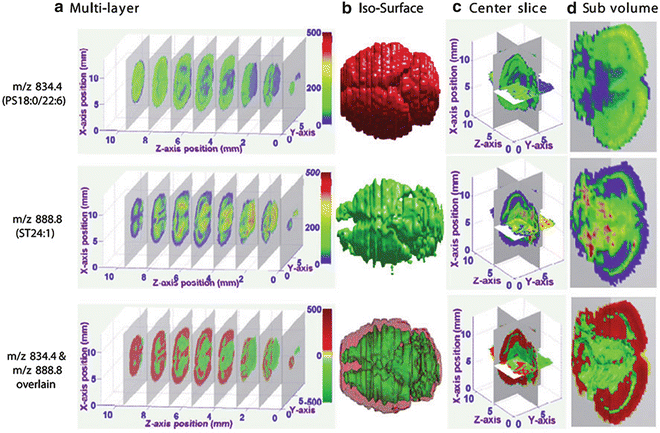
Perform 3D visualization on the 3D data set using the 3D Visualization Module in MATLAB (see Note 17 ).
2.
Generate both 2D and 3D images in three different forms, including iso-surface, slice surface, and subvolume (Fig. 7).

