Survival endpoints
Endpoint
Power
Initial event
Final event
Biases
Overall survival (OS)
Very high
Diagnosis time
Death
Other than cancer death causes
Clinical trial enrollment (for randomized controlled trials)
Disease specific survival (DSS)
High
Diagnosis time
Cancer death
The definition of ‘cancer related death’ in some cases could be questionable (e.g. suicide in cancer patient)
Clinical trial enrollment (for randomized controlled trials)
Disease free survival (DFS)
High
End of primary cancer treatment
Local relapse or metastases onset
Definition of ‘complete response’ and ‘local relapse’ or ‘metastases’ findings influenced by diagnostic times and imaging interpretation
Metastases free survival (MFS)
Average
Diagnosis time
Distant metastasis finding
Definition of ‘metastases’ findings influenced by diagnostic times and imaging interpretation
Clinical trial enrollment (for randomized controlled trials)
Local control (LC)
Average
End of primary cancer treatment
Local relapse
Definition of ‘complete response’ and ‘local relapse’ findings influenced by diagnostic times and imaging interpretation
Progression free survival (PFS)
Poor
End of (primary) cancer treatment
Progression finding
Adequate diagnostic definition of ‘progression’ according to pre-defined criteria (RECIST 1.1), diagnostic times
As previously stated the collection of survival data has to consider the possibility that patients can show the event at a given time after the start, but it is also possible that during the observation time a patient does not show the event, or in other cases the patients could be ‘lost’ during follow up. The survival statistics have the possibility to take into account all these situations: usually, when compiling survival tables in statistical software packages, observers indicate the presence of the event at a given time using the number ‘1’, if the patient does not show the event at the time of last follow up this condition is indicated by the number ‘0’. These cases are usually indicated as ‘censored’, because as in a census the survival data are updated by considering the condition of the whole observed population at a given moment. Patients lost on follow up should be excluded from the analysis, by assigning them a conventional value (e.g. ‘−1’) that the statistical software simply will not consider for the survival analysis or they can be considered simply as censored at the time of last follow up. However, using this last method, the possibility to decrease the median follow up time for a whole patient cohort could be higher, because the follow up time of the lost patients will not be further updated moving far from the beginning of the accrual. For other kinds of statistical analysis (that do not consider the survival time) having these patients at one’s disposal could be still useful, so they should not be deleted completely from the data collection tables.
The survival analyses can be performed mainly in three different ways that will be described in the three following sections:
1.
Non parametric analysis—Kaplan-Meier: a model describing the observed survival outcome(s) (without underlying parameters).
2.
Parametric analysis—Exponential, Weibull: models using parameters to describe and calculate the survival by a mathematical function that fits the survival data.
3.
Semi-parametric analysis—Cox’s Proportional Hazards Model (CPHM): a model that allows to calculate the expected survival for a single subject by using specific parameters and observational survival data (baseline hazard).
2 Non-Parametric Analysis: Kaplan-Meier
The Kaplan-Meier (KM) survival curves represent the visual description of the survival phenomenon in a given patient population. The creation of these curves requires first of all the collection of survival times and the status of the patients, split in censored (not checked endpoint) and patients with checked endpoint. In Table 2 an example of data collection is shown: the censored patients are shown in column 3 using the number 0, while the checked ones (patients showing the event) using the number 1. The related KM survival curve is shown in Fig. 1. In KM survival curves the proportion of surviving patients in a given population is shown, step by step, and the height of the steps is proportional to the number of patients showing the occurring event (death, local relapse, metastases finding etc.) during follow up time and inversely proportional to the number of subjects at risk at the moment of the event. In column 7 of Table 2 each step contributing to the graph appearance is calculated. A typical aspect of a KM survival curve is given by the height of the steps, which grows moving away from the beginning of the observation time. This is a consequence of the fact that each step represents a single patient for whom the event occurs at a definite time, while the small vertical lines along the horizontal segments of the curve represent the censored patients. The absolute number of remaining patients after a sequence of occurred events is increasingly smaller, so being the fraction of each patient showing the event over the number of remaining patients consistently larger (1/n i ), and finally being represented by a longer vertical segment in the curve.
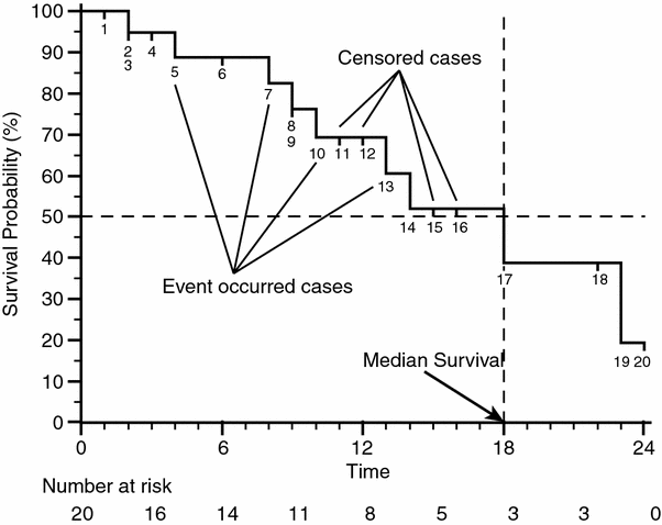
Table 2
Data for Kaplan Meier survival curve definition
Kaplan-Meier data table | ||||||
|---|---|---|---|---|---|---|
1 | 2 | 3 | 4 | 5 | 6 | 7 |
Rank i | Overall Survival time t | Status (observed events) d | FUP Status d fup | No. Patient at risk n | Proportion of surviving patients at each step i: with  with  | Overall surviving fraction at time t: with  with  |
1 | 1 | 0 | 1 | 20 | 1.000000 | 1.000000 |
2 | 2 | 1 | 0 | 19 | 0.947368 | 0.947368 |
3 | 2 | 0 | 1 | 19 | 0.947368 | 0.947368 |
4 | 3 | 0 | 1 | 17 | 0.947368 | 0.947368 |
5 | 4 | 1 | 0 | 16 | 0.937500 | 0.888158 |
6 | 6 | 0 | 1 | 15 | 0.937500 | 0.888158 |
7 | 8 | 1 | 0 | 14 | 0.928571 | 0.824718 |
8 | 9 | 0 | 1 | 13 | 0.928571 | 0.824718 |
9 | 9 | 1 | 0 | 13 | 0.923077 | 0.761278 |
10 | 10 | 1 | 0 | 11 | 0.909091 | 0.692071 |
11 | 11 | 0 | 1 | 10 | 0.909091 | 0.692071 |
12 | 12 | 0 | 1 | 9 | 0.909091 | 0.692071 |
13 | 13 | 1 | 0 | 8 | 0.875000 | 0.605562 |
14 | 14 | 1 | 0 | 7 | 0.857143 | 0.519053 |
15 | 15 | 0 | 1 | 6 | 0.857143 | 0.519053 |
16 | 16 | 0 | 1 | 5 | 0.857143 | 0.519053 |
17 | 18 | 1 | 0 | 4 | 0.750000 | 0.389290 |
18 | 22 | 0 | 1 | 3 | 0.750000 | 0.389290 |
19 | 23 | 1 | 0 | 2 | 0.500000 | 0.194645 |
20 | 24 | 0 | 1 | 1 | 0.500000 | 0.194645 |

Fig. 1
Example of Kaplan-Meier survival curve: labels show the events and the censored cases, the dashed lines show how to calculate the median survival of the case series, by drawing a line that moves from the value of 50 % of survival probability to a vertical step in the curve, and drawing a second line that drops down to the timeline. In the line below the graph the value of the number at risk is shown every 3 months in the timeline
When the patient with the highest follow up time shows the event ‘1’ the KM curve falls to 0 in the value of Survival Probability, and generally events in the rightmost part of the curve seem more effective at influencing the outcome than events in the leftmost part. Researchers have to be very careful in selecting adequate follow up times to be displayed and the number of patients in order to prevent unreliable behaviors shown by KM survival curves, which could lead readers to incorrect conclusions. Another feature that can be easily obtained by the KM survival curves is the median survival. In Fig. 1 it has been found by drawing a horizontal line starting from the 50 % of survival probability on the vertical axis and finding the intersection with a vertical segment of the curve, the value of the median survival is given by the intersection of a vertical line starting from this segment with the horizontal axis. Despite the value of the median survival, which is widely reported in literature, it is important to point out that it is not always a good indicator to compare different treatments administered to different patients cohorts. Furthermore the impact of median follow up time and the shape of the KM survival curve should always be considered together. A basic but good tool to achieve a summary is the possibility, provided by many statistical software packages, to add under the x axis of the graph the ‘number at risk’ at regular intervals (also shown in Fig. 1). The ‘number at risk’ is defined as the number of patients who are known not to have experienced some event at that time-point nor having been censored before the time-point: as a rule of thumb the curve can be particularly unreliable when the number of patients remaining at risk is less than 15 (Machin et al. 2006).
Another critical topic in the evaluation of KM survival curves is the evaluation of follow up maturity, and this is usually reported by indicating the median follow up time (MFUP). Different ways for calculating the MFUP have been proposed but the most widely used is the one using the ‘reverse Kaplan-Meier’ estimation of the OS (Schemper and Smith 1996): patients still alive (censored) are patients for whom the follow up time is known, while for patients that experienced death we cannot know if there would have been further follow up after the time of death. So the solution is to create a column in the statistical software that swaps the value of the overall survival endpoint, setting ‘1’ for censored patients (‘0’ in the column of the overall survival status) and ‘0’ for dead patients (‘1’ in the column of the overall survival status). The results should be similar to column 3 (OS status) and 4 (FUP status) of Table 2. Finally a new KM curve can be calculated by using this follow up status column as a series of events, and then the MFUP can be calculated in the same way as for calculating the median survival described before (Fig. 2, MFUP = 15 months). The value of MFUP should always be taken into account (and always mentioned in publications describing survival statistics) when reading statements about median OS. Figure 3 shows how the value of different MFUP compared with identical median OS can impact the reliability of the latter calculated by KM survival curves.
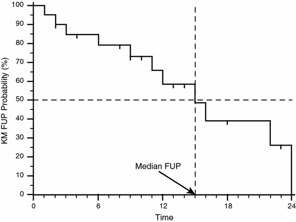
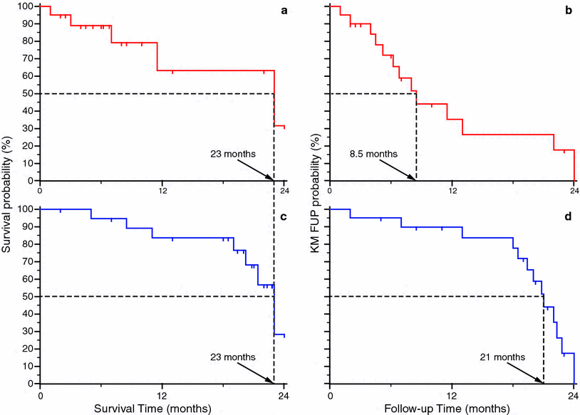

Fig. 2
Calculation of the median follow-up (MFUP) time for the case series in Table 2. Using as ‘status’ value the column d fup in Table 2 a new KM survival curve has been drawn. The value of the MFUP is achieved by using the same method to get the median OS in Fig. 1, by drawing a horizontal line from the value of 50 % of survival (in this plot it corresponds to the 50 % of KM FUP probability) and then finding the intersection with a vertical segment of the KM curve. Starting from this segment a vertical line is drawn down to the horizontal axis (the FUP time) to get the value, in this case 15 months

Fig. 3
Example of use of median follow-up (MFUP) times to evaluate the consistence of observed overall (OS) survival. The two series have the same median OS time (23 months: a, c), but different values of MFUP times can be calculated using a KM approach. The red series shows many censored cases in the left part of the curve ‘a’, giving a median follow-up time that is 8.5 months (b). However it is very low if compared with the median overall survival found in the fig. ‘a’, and so the latter value could be definitely not reliable. Using the KM computation approach the blue series shows a more adequate median follow-up time of 21 months (d), that gives consistence to related OS value
A good evaluation of the reliability of the median overall (and other kinds of) survival can be achieved by comparing it to the value of the MFUP. No exact criteria are known to give a judgment about this comparison; but large differences in the two values are suspicious for unreliable median survival value. Finally much care has to be used in considering the MFUP as the only parameter to evaluate the maturity of the follow up of a patient series because it has been proven misleading in some cases (Shuster 1991).
2.1 Comparison Among Kaplan-Meier Survival Curves
The KM survival analysis is extensively used by researchers to compare the effect of a factor on different patients populations. When the hypothesis is that a factor can affect the outcome in terms of survival, typical statistical software packages allow us to compare populations and plot a graph with two (or more) overlapping curves, in order to show how it leads to differences in the survival outcome. The factor cannot be a continuous variable, rather it must be a categorical variable (e.g. sex, different chemotherapy regimens, experimental drug versus placebo etc.) or a classification of the patient population in two (or more) categories using a pre-defined cut-off on a continuous numerical variable (e.g. the level of a serum marker, the radiation dose, an age cut-off etc.). The analysis across different patients series is usually performed by using the Logrank test, also referred as the Mantel-Cox test (Mantel 1966). The Logrank test compares estimates of the hazard functions of the two groups at each observed event time. It is constructed by computing the observed and expected number of events in one of the groups at each observed event time and then adding these to obtain an overall summary across all time points where an event occurs. Finally, in order to get the value of significance of the Logrank test, a χ2 statistics is calculated over this summation for the different populations and the value of the probability to reject the null hypothesis (that is: the factor doesn’t affect the survival outcome) can be achieved by referring to  , and thus calculating the final p value.
 , and thus calculating the final p value.
Many variables can influence the final result of the p value. First of all the number of patients enrolled in the analysis, due to the fact that of course calculations of the observed and expected events are directly influenced by the total number of cases. So, when observing relatively small differences among different KM survival curves, the increase of the number of the observed patients can provide a strategy to support the hypothesis that the factor actually influences the outcome. Starting from the KM Logrank test calculation, when a protocol is planned, it is useful to calculate in advance the population needed to discriminate a significant difference in survival rates, by using as hypothesis the rates observed on smaller populations not yet giving significant results. Many software packages offer the possibility to perform such a power calculation very easily. An example of similar curves calculated over different population sizes is given in Fig. 4. It shows two graphs: plot ‘a’ represents two KM survival curves for two populations of patients, each one counting 30 patients. The ‘blue’ population seems to have a better survival than the ‘red’ one. But the Logrank test gives a p = 0.10 and so, it is not significant; in the plot ‘b’ we have simply doubled the number of cases, each patients group counting 60 cases, and kept the position of the events in the timeline similar to the case series in the plot ‘a’: the final shape of the curves in ‘a’ and ‘b’ seems very similar, but now the Logrank test provides a statistically significant value of p = 0.02. Another feature that can be shown in the KM survival curves by many statistical software packages is the width of the confidence intervals (CI) for the survival curves (the dashed lines in Fig. 4). The overlap between the CI areas is larger in plot ‘a’ than in plot ‘b’, furthermore the CI of the survival probability at 36 months has been drawn by using arrowheads lines on the survival axis and the level of uncertainty of the calculation of this value is apparently larger for the case series in plot ‘a’ than in plot ‘b’. These features of the graphs represent the visual appearance of the significance in the difference between the two populations, and can be added to plots by researchers, if needed, to enhance the characteristics of the case series.
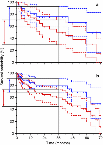

Fig. 4
Comparison of Kaplan-Meier survival curves for different populations. In the graph ‘a’ each series counts 30 patients, the Logrank test p value is not significant (0.10). In the graph ‘b’ each series counts 60 patients and the p value is 0.02 (significant). The confidence intervals are plotted as dashed lines, the values of the survival confidence intervals at 36 months are shown as arrowheads lines on the survival axis, being the width of the confidence intervals smaller in the plot ‘b’ than in the plot ‘a’ because of the difference in the number of patients per series
Another parameter usually calculated by statistical tools is the hazard ratio (HR). The HR is the ratio of the hazard rates corresponding to the conditions described by two levels of an explanatory variable. For example, in a study comparing a population undergoing an experimental therapy regimen versus a control population, the population treated with the experimental regimen may show the event at half the rate per unit time as the control population. The hazard ratio would be 0.5, indicating higher hazard of showing an event from the untreated population. The HR can be calculated by the Eq. (1):


(1)
In this equation O X is the summation of the observed events (death, local recurrence etc.) while E X is the summation of the expected events in two different populations (A and B). It is possible to calculate the CI for the HR too, giving an idea of the reliability of the results. When the HR = 1 there is no difference between the two examined populations. An HR < 1 means that the hazard is lower for population on numerator while a HR > 1 means that it is higher. The HRs calculated for the two populations (each one divided in two groups, red and blue) in Fig. 4 are summarized in Table 3.
Another important concept in studying survival, slightly different from the HR, is the odds ratio (OR). The OR is calculated from Eq. (2):
![$$ OR = \frac{{\left( {O_{Ex} /Ex} \right)/\left[ {1 - \left( {O_{Ex} /Ex} \right)} \right]}}{{\left( {O_{Nex} /Nex} \right)/\left[ {1 - \left( {O_{Nex} /Nex} \right)} \right]}} $$](/wp-content/uploads/2016/04/A174_2013_854_Chapter_Equ2.gif)
where O is the number of observed events (death, recurrence etc.) in the exposed (O Ex ) or not exposed (O Nex ) patients, Ex is the total number of patients exposed to a given factor, Nex is the total number of the patients not exposed to the factor (controls). OR’s are very important in meta-analyses because they can be primarily used to compute the comparison among different studies related to similar outcome and inclusion criteria. In this context the final objective is to get the results of different source studies in order to identify patterns among study results, sources of disagreement among those results, or other interesting relationships that may come to light in the context of multiple studies (Greenland and O’ Rourke 2008).
![$$ OR = \frac{{\left( {O_{Ex} /Ex} \right)/\left[ {1 - \left( {O_{Ex} /Ex} \right)} \right]}}{{\left( {O_{Nex} /Nex} \right)/\left[ {1 - \left( {O_{Nex} /Nex} \right)} \right]}} $$](/wp-content/uploads/2016/04/A174_2013_854_Chapter_Equ2.gif)
(2)
3 Parametric Analysis
It is possible to refer the hazard to an instantaneous value, defining it as hazard rate. It shows the risk in a specific time interval related to a given observed population and it can be calculated using Eq. (3):

where d is the number of events observed in the given time interval t, while the denominator is the cumulated time-to event since the beginning of the interval. For example, if during our chosen time interval of 30 days among the 10 patients under observation one exhibits an event at day 5 and another one shows an event at day 15, we have λ t = 2/(20 + 240) = 2/260 = 0.00769 because 2, the numerator, is the number of events, 20 is the sum of 5 and 15 (cumulated time-to-event for patients who show the event) and we add the product of 8 patients who did not show the event by 30 days (interval duration), giving 240. This is the same as assigning 30 days as time-to-event for patients with no events. The method is perfectly consistent because the number of affected patients is well represented by the numerator of the fraction. In some clinical conditions it is possible to assume that the hazard rate doesn’t change during a long observation time, thus remaining constant. In this case the survival function can be computed as an exponential function in which survival is given in the form of Eq. (4):

and the only parameter involved in the function is the constant λ, since time t is the independent variable of Eq. (4). In this particular condition it could be very easy to fit the survival function to a single parameter, and use it to predict the outcome in a given patients population. Unfortunately, analyzing the majority of clinical situations, the hazard rate is modified during time, being λ itself a value subject to change over time. For example the rate of local recurrence after the surgery, or the mortality due to postoperative complications, can be higher in the first months after surgery than after some years of follow up. In these conditions it is sometimes feasible to assess the variation of the hazard rate as a function of time t. A model that can describe this behavior is the Weibull distribution described by Eq. (5):


(3)

(4)

(5)
In this equation the parameter κ can assume different values reflecting the trend in the hazard rate variation during time:
κ < 1: the hazard rate is highest in the first part of the curve, meaning that there is a factor that can increase proportionally the number of the events during the first part of the follow-up time;
κ = 1: the hazard rate is constant over time. It means that the trend of the Weibull distribution is identical to an exponential distribution with the same λ value: with
κ > 1: the hazard rate is highest in the second part of the curve, while in the first part it seems to have slowed giving to the survival curve a two phases appearance with opposite convexity, upward in the first part, downward in the second part.
The appearance of three Weibull distribution curves according different values of κ is shown in Fig. 5. Figure 6 shows an example of non parametric distribution (Kaplan-Meier) with corresponding fitted exponential and Weibull distributions.
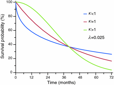
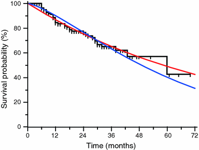

Fig. 5
Example of three Weibull distribution curves with different values of κ and equal λ. With κ<1 (blue curve) the hazard rate is higher in the first part of the curve, and the survival probability decreases faster in this tract than the curve with κ = 1, that is the exponential distribution. The green curve shows the trend of the Weibull distribution with κ > 1, with the classical ‘two phases’ convexity trend, oriented upwards in the first part of the curve and downwards in the second part

Fig. 6
Example of two parametric models (red exponential, blue Weibull) fitted to a given empirical Kaplan-Meier distribution (black). The value of the parameters change according the function used: exponential, λ = 0.01186; Weibull, λ = 0.01551, κ = 1.33906
4 Semi-parametric Analysis: Cox’s Proportional Hazards Model
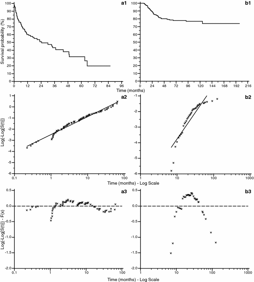
The value of the hazard rate can be a function of time and can be expressed as λ(t). This variability in most real clinical situations cannot be expressed correctly using parametric survival functions. In order to assess this trend it is possible to find the relation between hazard rate and time by using the specific plot shown in Fig. 7, where two survival curves are plotted against the complementary log transformation (CLT), that is ![$$ \log \left\{ { - \log \left[ {S\left( t \right)} \right]} \right\} $$](/wp-content/uploads/2016/04/A174_2013_854_Chapter_IEq3.gif) against
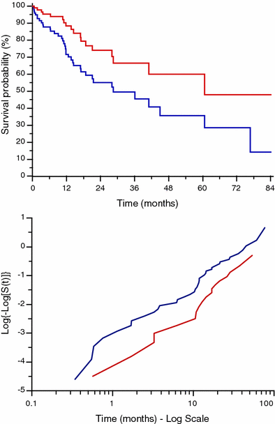
against  . This graph points out the correlation between survival rate and time, allowing to find if there is a constant rate rather than a variable rate of λ. When the CLT shows a good fit of the data points around a regression line (Fig. 7a2) it means that the hazard rate is roughly constant, and the survival function can be expressed in the exponential form shown in Eq. (4). In other cases (Fig. 7b2) there could not be a good fit of the data along the regression line function. In order to enhance these findings it is also possible to display the difference between the CLT points and the data points predicted by the regression function using the plot of residuals (Fig. 7a3, b3). This graph shows the distance between each point from the predicted one on the y axis, and gives a direct measure of the agreement of the survival predicted function with the observed data. In the ideal condition of a parametric fitting with exponential form the observed points should align on the horizontal line traced from the value of ‘0’ in the y axis as in Fig. 7a3, but in all other cases the results are much more similar to the plot shown in Fig. 7b3, where there is no alignment in the plot of residuals. In this case λ has to be expressed as function of time in the form λ(t). In Fig. 8 the plot of two survival curves is compared to the corresponding CLTs. The two series show a different survival rate and the CLT graph shows that the hazard rate is not constant, not having a linear-like appearance. But the two CLT lines show similar trends, seemingly ‘parallel’ because there is an approximately constant vertical distance between them at any given time. This typical appearance means that there is a proportion between the survival rates in the two populations. Starting from this kind of findings in the survival curves among populations differentiated by specific factors D. R. Cox published his fundamental paper where he described the proportional hazards regression model (PHRM, Cox 1972). In the main assumption of the model the hazard for a particular patient has to be related to the average underlying hazard of the whole examined population. We denote this average hazard as λ0(t), and the hazard for the specific patient can be specified as:

where h(t) is a function of time t (Machin et al. 2006). In this condition it does not matter which is the function of distribution of the hazards allowing to model any survival data collection characterized by a time-dependent hazard rate. The only assumption to be satisfied in the PHRM is that the hazards in the groups must remain proportional to each other over time. In the PHRM usually the factors that can affect the outcome are named covariates. The covariates are variables that can be numerical and continuous (e.g. age, hemoglobin level, a serum-marker level etc.) or can be categorical (e.g. sex, tumor clinical stage, therapy protocol etc.). The relation that exists among survival and covariates can be calculated by using the following assumptions and equations:
![$$ S_{i} \left( t \right) = e^{{\left\{ { - H_{i} \left( t \right)} \right\}}} = e^{{\left\{ { - H_{0} \left( t \right) \cdot e^{{\left[ {x_{i} \beta } \right]}} } \right\}}} $$](/wp-content/uploads/2016/04/A174_2013_854_Chapter_Equ7.gif)
![$$ S_{i} \left( t \right) = \left\{ {e^{{\left[ { - H_{0} \left( t \right)} \right]}} } \right\}^{{e^{{\left\{ {x_{i} \beta } \right\}}} }} = S_{0} \left( t \right)^{{e^{{\left\{ {x_{i} \beta } \right\}}} }} $$](/wp-content/uploads/2016/04/A174_2013_854_Chapter_Equ8.gif)
where H 0 (t) is the baseline hazard at time t and S 0(t) is the baseline survival at time t. They are the value of the hazard function and survival function achieved just with all the covariates values set to ‘0’ at the time t. The statistical software packages usually provide either a table with the values of H 0 (t) or the values of S 0(t) after the computation of the PHRM. Note that the survival at mean of covariate (further output usually calculated) cannot be used in place of S 0(t) that is the survival with all covariates values set to ‘0’, as previously stated. An example of application of PHRM is given in the following section, the dataset is shown in Appendix 1.
![$$ \log \left\{ { - \log \left[ {S\left( t \right)} \right]} \right\} $$](/wp-content/uploads/2016/04/A174_2013_854_Chapter_IEq3.gif) against
against  . This graph points out the correlation between survival rate and time, allowing to find if there is a constant rate rather than a variable rate of λ. When the CLT shows a good fit of the data points around a regression line (Fig. 7a2) it means that the hazard rate is roughly constant, and the survival function can be expressed in the exponential form shown in Eq. (4). In other cases (Fig. 7b2) there could not be a good fit of the data along the regression line function. In order to enhance these findings it is also possible to display the difference between the CLT points and the data points predicted by the regression function using the plot of residuals (Fig. 7a3, b3). This graph shows the distance between each point from the predicted one on the y axis, and gives a direct measure of the agreement of the survival predicted function with the observed data. In the ideal condition of a parametric fitting with exponential form the observed points should align on the horizontal line traced from the value of ‘0’ in the y axis as in Fig. 7a3, but in all other cases the results are much more similar to the plot shown in Fig. 7b3, where there is no alignment in the plot of residuals. In this case λ has to be expressed as function of time in the form λ(t). In Fig. 8 the plot of two survival curves is compared to the corresponding CLTs. The two series show a different survival rate and the CLT graph shows that the hazard rate is not constant, not having a linear-like appearance. But the two CLT lines show similar trends, seemingly ‘parallel’ because there is an approximately constant vertical distance between them at any given time. This typical appearance means that there is a proportion between the survival rates in the two populations. Starting from this kind of findings in the survival curves among populations differentiated by specific factors D. R. Cox published his fundamental paper where he described the proportional hazards regression model (PHRM, Cox 1972). In the main assumption of the model the hazard for a particular patient has to be related to the average underlying hazard of the whole examined population. We denote this average hazard as λ0(t), and the hazard for the specific patient can be specified as:
Fig. 7
Comparison between a case series described by exponential survival function (a) and a case series with different survival function (b). The graphs n. 1 show the survival functions. The graphs n. 2 show the complementary log transformation: the graph a2 shows a better linear fit of survival values than graph b2. The graphs n. 3 show the value of residuals (difference between the complementary log transformation value and the log–linear regression function value): the absolute value of the residuals is larger for the b case series showing unacceptable fitting with the exponential survival function calculated over the data

Fig. 8
Comparison between two survival curves and corresponding complementary log transformation curves. The two CLT lines are not exactly linear but they seem to have the same trend being fairly parallel, meaning that there is a proportion in the survival rate between the two populations

(6)
1.
Each numerical covariate affects the outcome by the product between its coefficient β and its own value x;
2.
For categorical covariates each possible value has to be tested, during modeling procedures, as dummy variable, so the final results of the β coefficients can be different for each category of the covariate. If the category is not significant the value of the corresponding product  must be put to ‘0’, if significant
  the value of coefficient found with regression;
 must be put to ‘0’, if significant
  the value of coefficient found with regression;
3.
Being  the sum of the products of each covariate x related to patient i with its own coefficient β, the survival probability S i (t) for patient i at a given time t can be calculated using the following expressions:
 the sum of the products of each covariate x related to patient i with its own coefficient β, the survival probability S i (t) for patient i at a given time t can be calculated using the following expressions:
![$$ S_{i} \left( t \right) = e^{{\left\{ { - H_{i} \left( t \right)} \right\}}} = e^{{\left\{ { - H_{0} \left( t \right) \cdot e^{{\left[ {x_{i} \beta } \right]}} } \right\}}} $$](/wp-content/uploads/2016/04/A174_2013_854_Chapter_Equ7.gif)
(7)
![$$ S_{i} \left( t \right) = \left\{ {e^{{\left[ { - H_{0} \left( t \right)} \right]}} } \right\}^{{e^{{\left\{ {x_{i} \beta } \right\}}} }} = S_{0} \left( t \right)^{{e^{{\left\{ {x_{i} \beta } \right\}}} }} $$](/wp-content/uploads/2016/04/A174_2013_854_Chapter_Equ8.gif)
(8)
A population of 144 patients has been followed after the diagnosis of a kind of cancer for a maximum follow-up time of 70 months (MFUP = 29 months). The first problem to solve when defining a PHRM is the sample size. As a rule of thumb, the maximum number of covariates that can be analyzed in a binary outcome model (such as a PHRM) is given by the minimum value of the frequencies of the two response levels divided by 10 (Harrel 2001). So in this example we have 39 cases with censor status = 1 and 105 cases with censor status = 0. In this case being the minimum value of the frequencies = 39 we cannot analyze more than 4 (4×10 = 40) covariates in the model. So a set of 4 factors has been investigated: two factors (Factor 1 and Factor 2) are divided in two categories each; the last two factors are numerical and continuous: the age of the patients and a serum marker level. A series of Kaplan-Meier survival curves has been drawn: in Fig. 9 the appearance is shown of the subpopulations of patients categorized according to Factor 1 (categories ‘1’ and ‘0’), Factor 2 (categories ‘1’ and ‘0’), the two age classes (using a cut-off value of 37 years) and the two classes of serum marker level (generically defined ‘low’ and ‘high’ level). When analyzing continuous variables in order to detect relationships between those values and survival it can be useful to distinguish classes by dividing the population according to a specific cut-off. The cut-off value can be identified by the researcher looking at the data for ‘anomalous’ correlations or by using simple statistical methods, such as dividing the population in classes found by using the mean or, better, the median value of the continuous variable. This is an effective method because the median value of a continuous variable bisects the overall population into two subgroups with (nearly) the same number of cases (if the population is even the two subpopulations are equivalent, if it is odd the number of cases for each subpopulation is different for one case). Looking at the example for all the analyses the distinction between the curves is statistically significant according to the Logrank test (Fig. 9). But when one wants to analyze the impact of combined factors


Stay updated, free articles. Join our Telegram channel

Full access? Get Clinical Tree


