Abstract
The practice of medicine requires that decisions are made with incomplete information, working in a background of high uncertainty. Statistical tools are methods for understanding and managing uncertainty and help guide decision making. This chapter discusses the nature of quantitative data, probability and variability, the concept of Bayesian reasoning, and the process of forming and testing a hypothesis using statistical methods. The types of statistical tests that are available and when each is best used are discussed and reviewed. The use of graphical methods, including the receiver-operating characteristic curve, receives special attention. We also discuss the use of mixed methods in comparative effectiveness research and the vital importance of overcoming cognitive bias in study design and the interpretation of research results.
Keywords
Accuracy, Bayesian reasoning, bias, evidence, hypothesis testing, probability, sensitivity specificity, statistical power, statistical tests, uncertainty, variability, variance
Introduction
The practice of medicine frequently requires that physicians make critical diagnostic and treatment decisions with incomplete information, working in a background of high uncertainty. The specialty of diagnostic radiology is not exempt from this reality. Although people in other walks of life might view such a high-uncertainty/high-stakes situation to be paralyzing, inaction is rarely an option in the practice of medicine. Many doctors consider this to be a fundamental part of the art of medicine , wherein a skilled physician must have the courage to commit to a presumptive diagnosis and initiate a treatment plan without the luxury of absolute certainty. Experience has proven, however, that achieving desired patient outcomes requires that physicians also understand the science of medicine , including the relative probabilities of the various disease entities they are considering for a patient’s diagnosis, the limitations of available diagnostic tests to discriminate among them, and the strength of the evidence supporting the choices to be made among various available treatment options.
The nature of this evidence—and truly of all knowledge in medicine—is inherently stochastic; that is, it is subject to the laws of probability and statistics. It is therefore essential for physicians to understand the core mathematical concepts that underlie the data on which they rely, as well as how to use the tools of probabilistic, quantitative reasoning. Armed with a basic knowledge of statistical methods, physicians will be better able to interpret the relevant medical literature and draw the correct inferences from individual patient data, such as the results of a particular patient’s various lab results and diagnostic imaging tests. This is arguably the most important of the noninterpretive skills.
Probability provides an approach to quantifying uncertainty in data that inform decisions. Without it, there is no modern scientific method. At the core of the scientific method is testing of hypotheses via experimentation. The answer to any hypothetical is almost never a simple “yes” or “no” but rather some probability that the outcome of any given experiment or test reflects reality, as opposed to reflecting random chance.
The diagnostic process similarly involves the formation and testing of hypotheses of what disease may be present, often relying on the findings of medical imaging studies. Diagnosis is thus a process analogous to that of testing a hypothesis by asking a scientific question (is disease XX present) via an experiment (e.g., chest x-ray, computed tomography scan, complete blood count, or other lab test panel) that is sufficiently reproducible and reliable to allow actionable conclusions to be made. Quite often the experiment chosen is a modality of medical imaging. The answer to a diagnostic hypothesis being tested by imaging is rarely a simple “yes” or “no,” because radiographic appearances are rarely (if ever) pathognomonic. Instead, radiologists frequently report the results of their tests in terms of a differential diagnosis—a rank-ordered list of the most likely underlying explanations for the observed findings. Most radiologists attempt to focus their differential diagnoses on their own professional assessment of the relative likelihood of the diagnostic possibilities under consideration and in doing so rely on Bayesian reasoning, updating their own personal understanding of the pretest probability of disease with diagnostic information provided by imaging and other tests. To inform this reasoning, radiologists depend on their training, their experience, and the medical literature. But to avoid being misled and drawing incorrect conclusions from the literature, radiologists also need to understand what constitutes statistical rigor in any research study being reported and thus be equipped to assess the reliability of the results. This chapter reviews the basic statistical tools and approaches to quantitative reasoning that underlie these tasks.
Taxonomy of Data
A taxonomy of data is an important discussion because there are many different types of data, and the appropriate measure to summarize a variable and the appropriate statistical test that could be used to evaluate a particular experimental result depends first and foremost on the specific type of data under examination ( Fig. 18.1 ).
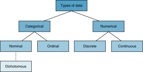
The first and largest categories of data are numerical and categorical . As the name implies, numerical data are numbers. These data are actual measured values. There are two types of numerical data: discrete and continuous. Discrete numerical data are measured in integers. For example, the Glasgow coma scale is a discrete numerical variable and takes on only integer values between 3 and 15. Continuous numerical data are represented on some segment of the real line. The significance of occupying some segment of the real line is that numeric variables are sensibly divisible. We can divide them by, say, 2 and still have a sensible data point. For example, report turnaround time or hospital length of stay are examples of continuous numerical variables; their values are on the real number line, and as such they can be divided by any real number and still have a sensible value.
Categorical data represent categories and not numbers, per se. Numbers may be used to represent the categories, but this is only for convenience. There are three types of categorical variables: nominal, ordinal , and dichotomous . Nominal data are variables that have categories with no particular order. Race/ethnicity and marital status are common examples. Numbers may be assigned to represent white non-Hispanic, black non-Hispanic, Hispanic, Asian, Native American, and others, but the number is for convenience, and the specific value and its implied order are irrelevant for nominal categorical variables. Ordinal categorical variables are also categories, but the order of the assigned number has significance. For example, in survey research, a Likert scale is commonly used to represent strength of response: 1, strongly disagree; 2, somewhat disagree; 3, neutral; 4, somewhat agree; 5, strongly agree. Thus, the fact that 3 is greater than 2 is meaningful because it indicates relatively more agreement. The third type of categorical data is dichotomous data. These data take on only two possible categories, for example, female or male, survived or died. It is conventional to use zeros and ones to represent these types of variables.
Data Summaries
Summarizing data appropriately depends on the type of data represented by the variables. We are usually interested in summarizing data by quantifying their central tendency (a number that represents a middle value) and its dispersion (how the data are distributed around the center). Continuous numerical data are best summarized using the average or mean , as well as the median or mode of a group of data. Variation of a variable is best summarized using the range of values, the variance or the standard deviation .
The most familiar measure of central tendency is the mean , or average, of a set of observed values, which is derived by taking the sum of all values divided by the number of observations. When the distribution of a variable is symmetric, the mean is a reasonable measure of central tendency. If the data are skewed or there are extreme values and outliers, then the median provides a more stable measure of central tendency. The median is the value for which an equal number of other observations are found to lie above or below it, and the mode is defined as the most commonly occurring value of the variable in the dataset. Variance is a measure of dispersion of a variable and is calculated as the sum of the square of each value minus its mean, divided by 1 minus the number of observations:
Variance = 1 n − 1 ∑ i = 1 n ( x i − x ¯ )
Standard deviation is the square root of the variance. When a variable is normally distributed—symmetric and bell-shaped—the standard deviation provides a convenient summary of the dispersion of the data. When data are normally distributed, it can be shown that 68% of observations will fall within one standard deviation of the mean, 95% of observations will fall within two standard deviations of the mean, and 99.7% of observations will fall within three standard deviations of the mean.
Normally distributed data are very common in the physical sciences. The distribution of the timing of nuclear decays of any particular isotope around the mean half-life is an example of a normally distributed variable. Most variables in medicine, however, are not normally distributed, and in such cases the standard deviation does not provide the same rule of thumb for spread, and thus reliance on the standard deviation can be misleading. For one common example, the standard deviation is often misused by professors in evaluating test scores of their students (e.g., “the mean of the test was a 60 with a standard deviation of 20”) or evaluating the teaching performance of radiology faculty (e.g., “the mean of Dr. Smith’s teaching scores from radiology resident questionnaires this quarter was 3.46 with a standard deviation of 1.5”). Because there is no reason to suspect that these sorts of data are normally distributed, the usual interpretation of standard deviation is uninformative.
Graphical Summaries
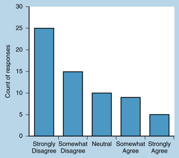
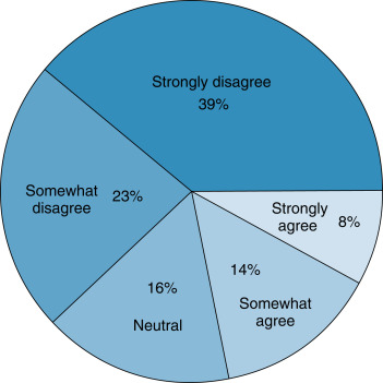
In addition to numerical summaries, data can be summarized using visual or graphical methods. Graphs can quickly convey a visual impression of the central tendency, dispersion, and the distribution of data. Categorical data can be summarized using bar charts , which present counts (or percentages) of categories. The distribution of categorical data can also be displayed using pie charts , which present percentages of categories. Fig. 18.2 presents data from a survey question measured with a 5-point Likert scale. These data are ordinal categorical data. The bar graph presents counts of responses. Fig. 18.3 summarizes the same ordinal categorical data from survey responses in proportions using a pie chart. The graphical presentations of the data in Figs. 18.2 and 18.3 provide similar but complementary information about the responses to the survey question.
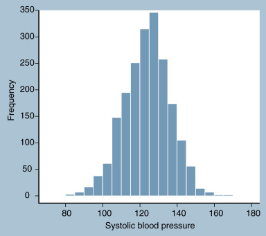
For continuous data, a histogram divides a variable into equally sized discrete units and then plots counts or percentages of observations that fall into each unit. An example is presented in Fig. 18.4 , which shows the distribution of systolic blood pressure in a sample of 2000 adults, including 1000 women and 1000 men.
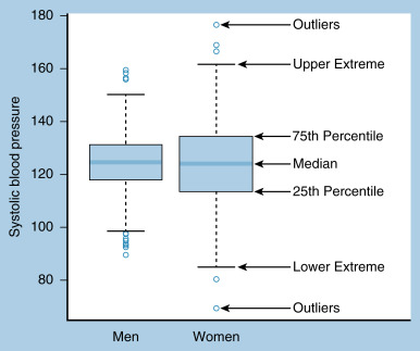
When there is a need to summarize the distribution of more than one continuous variable at once, or to stratify a continuous variable by two or more groups, boxplots provide an excellent visual summary. A boxplot presents the quartiles of the data, extreme values (usually defined as 1.5 times the interquartile range, or the difference between the 25th and 75th percentile), and any outliers beyond the extreme values. An example of a boxplot of systolic blood pressure for men and women is presented in Fig. 18.5 , with each summary indicated on the graph.
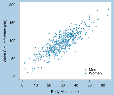
A visual summary of the correlation or relationship between two numerical variables can be made with a scatterplot . The scatterplot shown in Fig. 18.6 plots the relationship between body mass index and waist circumference. Note that by using separate colors we can distinguish the relationship between strata, in this case between men and women.
Probability
Probability is a measure of how likely it is that an event will occur. In other words, probability serves to quantify the level of uncertainty that is present in any given dataset. It is measured using a number between 0 and 1, where 0 represents absolute impossibility of the event and 1 represents absolute certainty of the event. Historically, there have been several definitions of probability. In most current scientific research, probability is interpreted according to the frequentist definition, which is that probability is the long-run relative frequency of the occurrence of an event. For example, we say that the probability of obtaining heads on a coin toss is 50%, not because heads is one of two possibilities, but rather because in a very large series of coin flips, heads occurs half of the time.
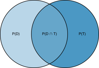
We call phenomena that have probabilities attached to them random variables . For example, a coin toss is a random variable; we know the set of possible outcomes of a coin toss (heads and tails), but we do not know which of these outcomes will be obtained before flipping the coin. Whether an individual has a disease is a random variable because we do not know whether the patient has a disease until we administer a diagnostic test. The sample space of a random variable is the set of all possible outcomes. The sample space for the random variable of whether an individual has a disease has two elements: yes and no. Probabilities describe the likelihood of each of the elements of the random variable. Sometimes probabilities are determined by two events. For example, assume we have two random variables: whether a patient has disease ( D ) and whether a diagnostic test result is positive ( T ). We use P ( D ) to denote the probability that a patient has disease, and we use P ( T ) to denote the probability that the patient tests positive for the disease. The probability that both events occur is the intersection of D and T , denoted P ( D ∩ B ).
Fig. 18.7 contains a Venn diagram that demonstrates these relationships. The circle on the left contains all patients who have disease; the circle on the right contains all patients who test positive. The intersection of the circles is represented by the overlapping region and contains just patients who have disease and who test positive. Two random events are independent if the occurrence of one of the events does not affect the occurrence of the other. If, on the other hand, the occurrence of one event does impact the occurrence of another event, the probabilities are called conditional . Disease and diagnostic tests are conditional probabilities because if a diagnostic test is positive, the patient is more likely to have disease. We denote a conditional probability as P ( T | D ), which is the probability of T (that a patient tests positive) given that D (the patient has disease) has occurred. We can compute P ( T | D ) in Fig. 18.7 as the area P ( T ∩ D ) divided by the area P ( D ).
Diagnostic Test Performance
Conditional probability is the underlying concept of diagnostic test performance. The most common measures of the performance of a diagnostic test are sensitivity and specificity. Sensitivity is P ( T | D ): the probability that a test result is positive given that a patient has disease. In a sample of patients, sensitivity is measured as the proportion of patients with disease who test positive. If a diagnostic test has high sensitivity, then it is informative about patients who have disease. Specificity is P ( T − | D −): the probability that a test result is negative given that a patient does not have disease. In a sample of patients, specificity is measured as the proportion of patients without disease who test negative. If a diagnostic test has high specificity, then it is informative about patients who do not have disease.
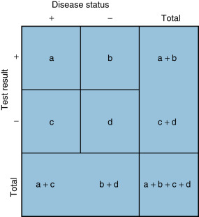
Fig. 18.8 illustrates how to compute these measures from a sample of patients. Suppose a diagnostic test with two possible outcomes (positive and negative) is administered to a group of patients who either do or do not have disease. In the diagnostic test matrix in Fig. 18.8 , the number of patients who test positive and actually have disease (the true-positive results) is a , and the number of patients who test positive who do not have disease (the false-positive results) is b . Similarly, the number of patients who have disease who test negative (the false-negative results) is c , and the number of patients who do not have disease who test negative (the true-negative results) is d . Sensitivity measures the proportion of patients who actually have disease among all patients who test positive: a /( a + c ). Diagnostic tests with a high specificity excel at ruling out disease, because negative test results suggest a low probability that disease is present. Specificity measures the proportion of patients who actually have no disease among all patients who test negative: d /( b + d ). Diagnostic tests with a high specificity excel at ruling in disease, because positive results suggest a high probability of the presence of disease. Overall test accuracy combines elements of sensitivity and specificity and measures the proportion of true results (i.e., true-positive plus true-negative) among all patients. Accuracy is defined as ( a + d )/( a + b + c + d ).
Although sensitivity and specificity are important measures of diagnostic test accuracy, most clinicians are less interested in the probability that a patient who has disease tests positive and more interested in the probability that a patient has disease given that a test is positive. That is, rather than P ( T | D ), clinicians need to know P ( D | T ). This quantity can be computed using Bayes’ theorem, which is a rule of conditional probability. Bayes’ theorem is:
P ( D | Τ ) = P ( T | D ) P ( D ) P ( T )
Related posts:


Stay updated, free articles. Join our Telegram channel

Full access? Get Clinical Tree


